

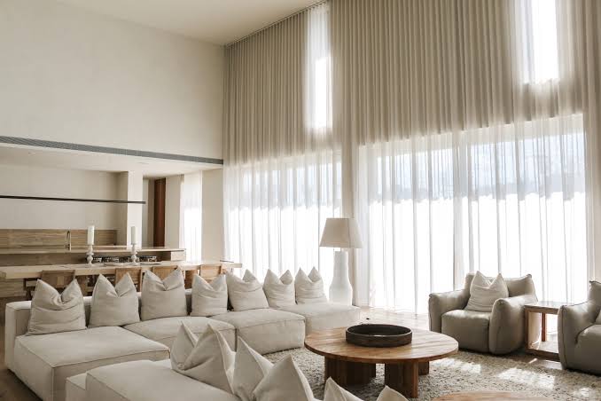
Neutral interiors have a reputation for being effortless. In reality, the most beautiful neutral rooms are anything but accidental. They rely on a careful interplay of tone, texture, proportion, pattern, and light. When there are fewer colors competing for attention, every material becomes more noticeable. A linen sofa, a marble coffee table, a woven rug, the finish of a wood floor, and, importantly, the window treatments all have a role to play.
This is what makes choosing window treatments for a neutral room both exciting and slightly tricky. The wrong shade of beige can make a room feel flat. A stark white curtain can look disconnected from warm furnishings. A cool gray can suddenly introduce a blue cast where you wanted softness. The right treatment, however, can give a neutral interior incredible depth. Think less about adding color and more about building layers of tone and texture.
Start With the Undertones
Before choosing a window treatment, identify the dominant undertone in the room. Is your neutral palette warm or cool? Warm neutrals include ivory, cream, beige, taupe, camel, mushroom, and warm gray. They tend to work beautifully with natural wood, brass, terracotta, warm stone, and earthy textiles.
Cool neutrals include crisp white, blue-gray, silver, and cooler taupes. These pair naturally with marble, chrome, blue, black, and other cooler tones. The distinction may seem subtle, but it matters.
A warm beige curtain can look beautifully integrated against cream walls and oak flooring. Place that same curtain in a cool white room with blue-gray furniture, and it may suddenly look yellow. The best neutral window treatment does not necessarily match the wall. It simply speaks the same tonal language.
Gray Is More Versatile Than You Think
Gray has become one of the great modern neutrals because it can move between warm and cool palettes with remarkable ease. Gray window roman shades are particularly useful when you want a neutral treatment with a little more definition than white or cream.
Pale gray can create an airy, contemporary feel. Medium gray adds subtle contrast without becoming dominant. Warm gray with beige or taupe undertones can feel wonderfully soft, while charcoal introduces drama. The secret is to look beyond the label.
Manufacturers may call a fabric “gray,” but the actual color could lean blue, green, brown, or violet. Always compare the fabric against your walls and furnishings in the room where it will be used. Natural light can reveal undertones that are almost invisible under showroom lighting.
Use Texture Instead of Color
One of the great pleasures of decorating with neutrals is that texture gets to take center stage. When your palette is restrained, you can layer fabrics without worrying about creating too much color contrast.
Think linen beside velvet. Smooth cotton beside a nubby weave. A subtle woven shade against a softly textured curtain. This is one reason neutral interiors can feel so luxurious without being visually loud.
A linen roman shade can introduce organic texture to a contemporary room. Velvet curtains can give a more traditional interior depth and softness. Slubby or woven fabrics can bring character to an otherwise minimalist space.
The important thing is variation. If everything is smooth and flat, the room may feel sterile. If every surface is heavily textured, it can feel visually chaotic. Aim for contrast.
Consider Roman Shades for a Tailored Finish
Roman shades are particularly well suited to neutral interiors because their structured folds add architectural definition without introducing a lot of visual clutter. Custom roman shades can be tailored to the exact dimensions of the window, allowing you to control both proportion and fabric placement.
In a minimalist living room, a simple linen shade in a warm neutral can feel almost architectural. In a more traditional space, a textured fabric or subtle pattern can add softness without overwhelming the room.
Roman shades are also useful when surrounding wall space is limited. Because they sit primarily within the window area, they can provide a polished treatment without requiring large expanses of fabric beside the opening.
Layer Shades With Curtains
If you want a neutral room to feel particularly luxurious, consider layering. A roman shade paired with curtains creates depth without requiring additional colors. Try a pale gray shade beneath warm ivory curtains. Or a textured taupe shade with cream linen panels. You could even combine a subtle patterned shade with plain curtains.
The important thing is to give each layer a role. The shade can handle privacy and light control, while the curtains provide softness and frame the architecture. When both treatments are made from carefully chosen neutral fabrics, the result can feel sophisticated rather than busy. And because the colors are restrained, you have more freedom to play with texture.
Don’t Be Afraid of Pattern
Neutral does not have to mean plain. In fact, a subtle pattern can be exactly what a neutral room needs. Patterned curtains can introduce visual interest while keeping the overall palette calm. Consider tonal stripes, small-scale checks, delicate botanicals, or understated geometrics.
A cream curtain with a slightly darker beige pattern can create far more depth than a completely solid fabric without introducing a new color family. The same principle works with roman shades. A tonal gray botanical or a geometric motif in taupe and ivory can add personality while remaining comfortably within a neutral palette. The key is contrast. A high-contrast black-and-white pattern will make a much stronger statement than an ivory-on-beige motif, even though both are technically neutral.
Use Sheers to Preserve Light
Neutral interiors often depend on natural light to create their airy quality. If you cover a bright window with a heavy, opaque treatment, you can lose some of that magic.
Sheer roman shades offer a beautifully understated alternative. They filter harsh sunlight while allowing the room to remain bright and luminous. Sheer curtains can create a similar effect, particularly when layered with heavier drapes.
During the day, the sheer layer softens the sunlight. In the evening, the heavier curtains can be drawn to create privacy and a more intimate atmosphere. This approach works particularly well in living rooms, dining rooms, and bedrooms where you want the windows to feel light rather than visually heavy.
Think About Contrast
A neutral room can become flat when every element is too close in tone. You do not necessarily need color to solve the problem. Instead, introduce tonal contrast.
If the walls are pale cream, consider a slightly deeper taupe shade. If the walls are medium gray, a pale ivory curtain can create a soft frame around the window. You can also use contrast through texture.
A matte linen shade against a subtly lustrous velvet curtain can create depth even when both fabrics are essentially the same color. The goal is to give the eye enough variation to move around the room.
Choose Curtains Based on the Architecture
In neutral interiors, the silhouette of the window treatment becomes especially important because there are fewer colors competing for attention. Long curtains can emphasize ceiling height and make a window feel larger. Wide curtain panels can visually expand a narrow opening.
For a particularly polished look, custom curtains allow you to control the exact length, fullness, width, and placement. Mount the rod higher than the window where appropriate, and extend it beyond the frame so the curtains can stack away from the glass. This creates a sense of generosity around the window and can make even a relatively modest opening feel more architectural.
Let Custom Drapes Add Drama
Neutral does not mean timid. If your room is built around creams, taupes, and soft whites, a substantial pair of custom drapes can become the element that gives the space presence.
Think warm camel, mushroom, charcoal, or deep taupe in a beautifully textured fabric. Because the color palette is restrained, you can afford to use more substantial materials without making the room feel overly decorative. Velvet in a warm neutral can be particularly effective in a formal living room or bedroom, while linen creates a more relaxed interpretation of luxury.
Don’t Forget the Floor and Ceiling
Window treatments should relate to the architecture beyond the window itself. Look at your flooring. Warm oak floors may call for warm neutral fabrics. Cool stone floors might work better with gray, ivory, or cooler taupe.
Then look upward. If the ceiling is low, using curtains that extend close to the ceiling can create visual height. If the ceiling is already dramatic, substantial drapery can reinforce its scale. The window treatment should help the room’s proportions rather than simply sit inside them.
Neutral Does Not Mean One Note
Perhaps the biggest misconception about neutral interiors is that everything needs to be the same color. The opposite is usually true. The most sophisticated neutral rooms contain many variations: ivory beside cream, beige beside taupe, gray beside mushroom, matte beside sheen, smooth beside textured. Your window treatments are an ideal place to introduce these subtle differences.
A pale roman shade can sit against deeper curtains. A tonal pattern can add movement. A textured fabric can bring warmth. A sheer layer can introduce lightness. None of these choices needs to be dramatic. Together, they create dimension.
The Designer’s Formula for Neutral Windows
If you’re unsure where to begin, keep it simple. Choose a color family. Add tonal variation. Introduce texture. Consider the pattern carefully. Then pay attention to proportion. A neutral window treatment should complement the room rather than disappear completely into it.
Look at the undertones before choosing the color. Consider how natural light changes throughout the day. Think about the relationship between the fabric and your flooring, furniture, and walls. And don’t underestimate the value of customization when proportions are unusual or when several treatments need to work together. The beauty of a neutral interior is that it gives you room to be subtle. You do not need a dramatic color to create impact.
Sometimes, the most luxurious room is the one where the curtains are barely different from the walls, the roman shade picks up a quiet tone from the rug, and the texture of the fabric reveals itself only when the afternoon light hits it. That is the art of decorating with neutrals. Nothing shouts. Everything speaks.
